Your website should aim to meet Level AA of the WCAG 2.0 rules, which have guidelines for creating accessible web applications that are now the basis for Section 508 standards, which our organization is legally mandated to meet.
Your website should follow the following four principles.
- Perceivable: Can the user perceive everything on the page?
- Operable: Can a user operate all parts of a page regardless of their input device?
- Understandable: Can a user understand the page?
- Robust: Is the page robust enough to be read by assistive devices and multiple browsers?
To understand more about how we build accessible interfaces according to POUR principles and get a checklist for these guidelines, read the CFPB Design System's guide on accessibility.
Testing for accessibility should be done throughout the project lifecycle.
Visit the CFPB's internal Accessibility documentation [links to GHE] (https://GHE/CFPB/hubcap/wiki/Accessibility) to learn how to audit your project work in a standardized manner.
You don't need any special hardware for your first accessibility test.
Keyboard testing is making sure that every part of your website
can be accessed by tabbing through the keyboard and
is done with the tab, shift + tab and enter keys.
By resolving issues with keyboard testing first, you can resolve other issues with inaccessible content with screenreaders or other assistive devices.
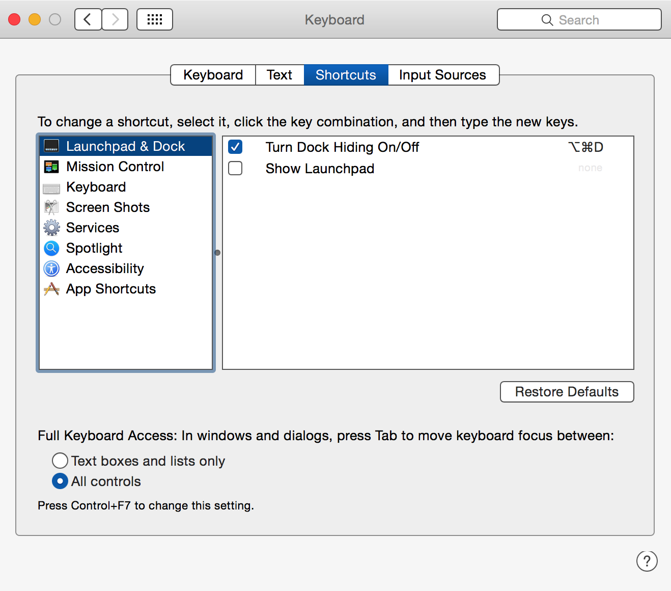
To turn on full keyboard access on a Mac, you may need to visit System Preferences >> Keyboard.
The following checklist is adapted from 18F's Accessibility Guide:
-
Using the tab, enter, and space bar, navigate the page and ensure each input/interaction can be triggered.
- Any forms on the page should be able to be completed using only the keyboard.
-
Ensure rollover / hover interactions (help text, etc) can be triggered as well.
- If the user cannot interact with something, or get the information another way, this is a failure.
-
Make sure the tab order of the page is logical and follows the visual order of elements on the page.
- If the tab order is confusing, this is a failure.
-
Check that the focus is always visible when moving through the page with the tab key.
- If you lose focus, on a hidden link or other object when simply tabbing through the page, this is a failure.
-
Make sure you can tab through the page and get back the address bar.
- If you ever need your mouse to get back to an element, this is a failure.
-
Keyboard users must be able to easily use and dismiss modal dialog boxes, lightboxes, or other pop-ups.
- Modal dialog boxes need to trap the keyboard. When a modal dialog box is triggered, the keyboard focus needs to immediately move to the first actionable element in the modal.
- The keyboard cannot use the modal dialog box until it is dismissed. When a user moves the keyboard focus past the last element in the modal dialog box, it needs to loop to the beginning of the dialog box.
- The keyboard user needs to be able to access all controls in the dialog box, especially the controls to dismiss the dialog.
- If the keyboard user cannot do all of these things, this is a failure.
- Ideally, the keyboard user should also be able to dismiss the modal dialog box with the Escape key.
-
If an interaction reveals hidden content, ensure the focus is moved to the revealed content.
- If this does not happen, check for a programmatic description of the change.
-
Check for title tags providing information not on the screen.
- Title attributes which can only be exposed by hovering the mouse over the element are a failure of keyboard access.
-
Check that the focus never goes to elements that won't be available to somebody using a mouse.
- If the keyboard focus goes to an offscreen element that has been temporarily hidden (items in a non-expanded drop-down menu, offscreen modals which haven't been triggered, etc.), this is a failure.
Read more about keyboard testing on WebAIM
WebAIM has a fantastic series and guide for using screenreaders for accessibility testing purposes.
- Using VoiceOver to evaluate web accessibility – Learn how to use the built-in screenreader program on Macs and iOS products.
- Using NVDA to evaluate web accessibility – Learn how to use NVDA, a free and open source screenreader for Windows.
Be sure to test new features on both VoiceOver and a Windows screen reader. Read our guide on Screen reader differences to understand the way screen readers work on different platforms and how to avoid creating bugs for Windows users.
Read more about screenreader testing on WebAIM
To ensure any new color combinations that need to be implemented are accessible, use the CFPB palette checker.
View our existing approved accessible color combinations for typography on the Design System
WAVE web accessibility evaluation tool by WebAIM - WAVE will detect missing accessibility tags and poor practices and explain their impact. They also have a toolbar extension.
Chrome Accessibility Developer Tools - A Chrome extension that adds an additional section to your developer tools to examine accessibility properties. Comes with audits to examine contrast, incorrect markup and other common errors.
Contrast Ratio Tool - Tests for contrast ratio based on the WCAG 2.0 guidelines on color contrast.
Colorblind Web Page Filter - Applies coverage filters on webpages to test against different types of color blindness
From The A11Y Project:
Native HTML semantics should still be used whenever possible, but ARIA is useful when certain design patterns or interactions make it impossible to do so. For example, a complex tabbed-interface has no semantic equivalent with HTML, but a
role="tablist"and its related attributes can be added to provide this detail to screen readers. ARIA is also useful to describe newer HTML elements that may not yet have full cross-browser support or be understood by screen readers.
Using appropriate semantic markup as outlined in the markup standards will avoid needing to overwrite the default behavior.
For example, instead of using <span role="button">, you can use a <button>.
ARIA landmark roles can be used by assistive technology to navigate a website.
HTML5 is moving towards including some of the functions in elements like main,
but accessibility support for HTML5 elements is still lacking in some browsers.
For now, including both the HTML5 element and the ARIA landmark
(ex: main and role="main")
is recommended.
A few examples of some of the more prominent landmark roles:
-
<header role="banner">A region of the page that is site focused. Typically your global page header.
-
<nav role="navigation">Contains navigational links.
-
<main role="main">Focal content of document. Use only once.
-
<article role="article">Represents an independent item of content. Use only once on outermost element of this type.
-
<aside role="complementary">Supporting section related to the main content even when separated.
-
<footer role="contentinfo">Contains information about the document (meta info, copyright, company info, etc).
-
<form role="search">Add a
searchrole to your primary search form.
More about ARIA in HTML from the W3C
Many screenreaders use heading tags (<h1>, <h2>, etc) to navigate websites
by using shortcuts to skip to certain headers and avoid navigation menus or repetitive content.
Do not skip numbers in descending order (e.g., <h1> to <h4>) or
have sections unlabeled by a header.
You can also label <section>s with the aria-labelledby="" attribute:
<section aria-labelledby="KittensHeader">
    <span id="KittensHeader">All About Kittens</span>
    <p>Lorem ipsum dolor sit amet, consectetuer adipiscing elit.</p>
</section>
Test for header flow using the WAVE tool.
Read more about aria-labelledby at MDN
Accessibility guidelines are from The A11Y Project, WebAIM, and Matt Long's It's Tired In Here accessibility guidelines (no longer available; final Wayback Machine snapshot: https://web.archive.org/web/20161029134726/http://itstiredinhere.com/accessibility/).