| Title | Description | Subjects | Tags | CatalogContent | ||||||
|---|---|---|---|---|---|---|---|---|---|---|
.Carpet() |
Creates carpet plots to visualize interactions between multiple variables in a two-dimensional plot. |
|
|
|
A carpet plot is a specialized visualization in Plotly that shows the interaction between two or more independent variables and one or more dependent variables in a two-dimensional plot. Carpet plots distinguish themselves from other plots by enabling more accurate interpolation of data points. They are created using the .Carpet() method of the graph_objects class.
Carpet plots are particularly useful in engineering, scientific research, and data analysis where visualizing relationships between multiple variables is necessary. They can serve as a foundation for other traces like scattercarpet and contourcarpet, which can specify a carpet plot on which they lie.
plotly.graph_objects.Carpet(a=None, aaxis=None, b=None, baxis=None, carpet=None, cheaterslope=None, color=None, x=None, y=None, ...)
Parameters:
a: An array containing values of the first parameter valueb: A two-dimensional array of y coordinates at each carpet pointx: A two-dimensional array of x coordinates at each carpet point. If omitted, the plot is a cheater plot with xaxis hidden by defaulty: A two-dimensional array of y coordinates at each carpet pointaaxis: Sets the a-axis properties (can be provided as a dictionary)baxis: Sets the b-axis properties (can be provided as a dictionary)carpet: An identifier for this carpet, so that scattercarpet and contourcarpet traces can specify which carpet plot they lie oncheaterslope: The shift applied to each successive row of data in creating a cheater plot (used when x is omitted)color: Sets the default color for all elements
Return value:
Returns a carpet object that can be added to a figure created with plotly.graph_objects.Figure().
To create a comprehensive carpet plot, the syntax should include a and b parameter values which define the coordinate system:
import plotly.graph_objects as go

fig = go.Figure(go.Carpet(
    a = [4, 4, 4, 4.5, 4.5, 4.5, 5, 5, 5, 6, 6, 6],
    b = [1, 2, 3, 1, 2, 3, 1, 2, 3, 1, 2, 3],
    y = [2, 3.5, 4, 3, 4.5, 5, 5.5, 6.5, 7.5, 8, 8.5, 10]
))

fig.show()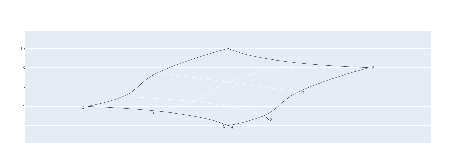
In this example, a and b arrays are included that define the coordinate system for our carpet plot. The values in these arrays correspond to the positions of the data points, creating a grid-like structure.
The carpet plot can be styled using axis properties to make it more visually appealing and easier to interpret:
import plotly.graph_objects as go

fig = go.Figure(go.Carpet(
    a = [4, 4, 4, 4.5, 4.5, 4.5, 5, 5, 5, 6, 6, 6],
    b = [1, 2, 3, 1, 2, 3, 1, 2, 3, 1, 2, 3],
    y = [2, 3.5, 4, 3, 4.5, 5, 5.5, 6.5, 7.5, 8, 8.5, 10],
    aaxis = dict(
        tickprefix = 'a = ',
        ticksuffix = 'm',
        smoothing = 1,
        minorgridcount = 9,
    ),
    baxis = dict(
        tickprefix = 'b = ',
        ticksuffix = 'Pa',
        smoothing = 1,
        minorgridcount = 9,
    )
))

fig.update_layout(
    plot_bgcolor = 'black',
    paper_bgcolor = 'black',
    font_color = 'white'
)

fig.show()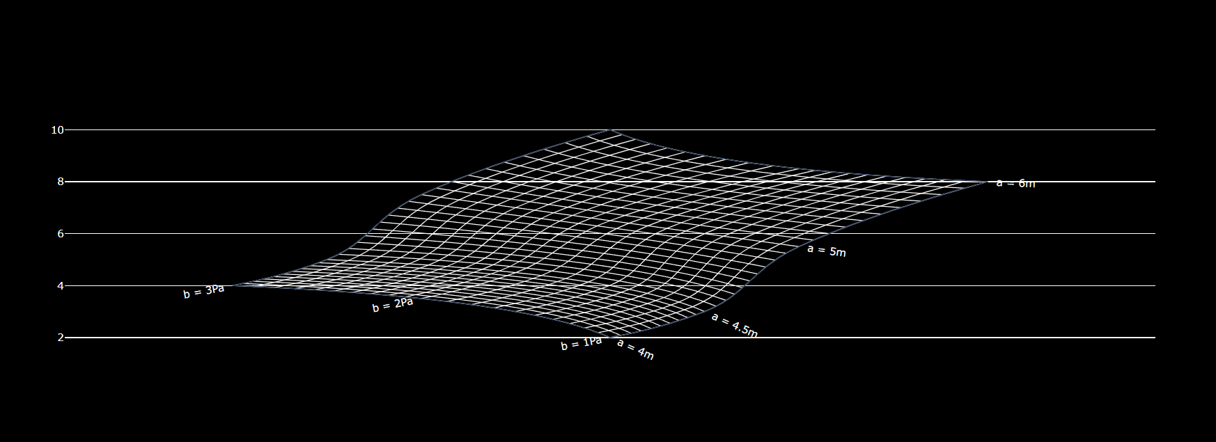
This example enhances the carpet plot by adding custom styling to the a and b axes. Tick prefixes and suffixes are included to indicate units, the smoothing parameter is adjusted, and minor grid lines are added. Additionally, the background colors are modified for better contrast:
For more complex data relationships, different cheatertype values can be used and the layout can be adjusted to better represent the data:
import plotly.graph_objects as go

fig = go.Figure(go.Carpet(
    a = [4, 4.5, 5, 6],
    b = [1, 2, 3],
    y = [[2, 3, 5.5, 8],
         [3.5, 4.5, 6.5, 8.5],
         [4, 5, 7.5, 10]],
    cheaterslope = -5,
    aaxis = dict(cheatertype = 'index'),
    baxis = dict(cheatertype = 'value')
))

fig.show()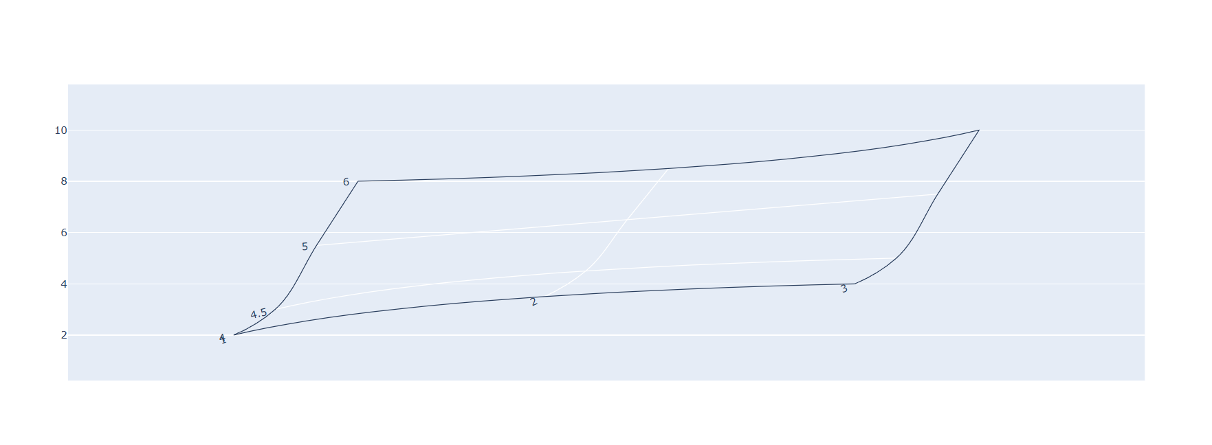
This example demonstrates using a more advanced configuration where:
- The
yparameter is provided as an array of arrays, representing a 2D grid - We set
cheaterslopeto -5, which changes how rows are shifted - The
cheatertypeproperty is set differently for the a and b axes
The cheatertype parameter controls how axes are constructed. When set to 'index', the axis uses the index position of values, while 'value' uses the actual values.
Note: The layout of cheater plots depends upon the cheaterslope and axis cheatertype parameters, which can be adjusted to achieve the desired visual representation.
Carpet plots provide a powerful way to visualize and analyze multi-dimensional data on a two-dimensional surface, especially for applications in engineering, physics, and advanced data analysis.
To improve your data visualization skills, check out our Intro to Data Visualization with Python course, where you'll learn to create line, bar, and pie charts, scatterplots, histograms, and more. You'll also learn how to customize charts and annotate them with error bars and text.