Change the background color of material website to make it more readable #9339
Comments
|
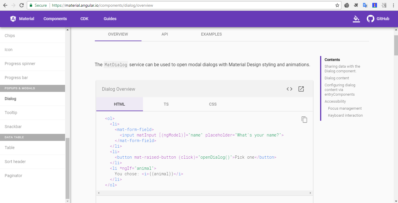
Screenshot? |
|
Here are some... |


|
It does look like many of the syntax highlighting colors don't meet W3C contrast standards |
|
Also, I find some docs that are difficult to read using the following theme:
|


|
@jelbourn yups, I realize this contrast issue is more than background color. Syntax highlighting too has to improve.and may be font weights too? |
|
This issue should be logged here: https://github.com/angular/material.angular.io Closing this and logging over there: angular/material.angular.io#398 |
|
This issue has been automatically locked due to inactivity. Read more about our automatic conversation locking policy. This action has been performed automatically by a bot. |
feature request, or proposal:
To make the documentation more readable, please change the background color to lighter shade of gray/grey
What is the current behavior?
Currently if one navigates to individual components at material.angular.io/components/, the Font color and the background color are close in shade. Moreover a thinner (less weight) font make it difficult to read. (to me, this is little against the material design philosophy of readability).
The text was updated successfully, but these errors were encountered: