Modal dialog button colors? #24285
Comments
 wxiaoguang
added
type/proposal
wxiaoguang
added
type/proposal
|
2 or 5 for me. Style of 2 with text of 5. |
Added 5 , at the moment, all default texts are Yes/No or Confirm/Cancel. |
|
Maybe we can always use style 5 from now on. Actually it has already been used widely in Gitea's UI. At the moment, some old dialogs are style 1, which don't look good to me 😁 I will come back to collect more opinions tomorrow. |
|
I think I prefer 2, simply as it isn't as confusing. |
Good question, the "primary" button is green on arc-green .....
But we can have BLUE:
|


|
Then it looks like I hoped for. |
|
When rewriting the old code ( Improve some modal action buttons #24289 ), I also found that there are "yellow" buttons in code 🤣 I guess it might be better than "blue" for "destructive action" And I added a devtest page for the modal buttons, welcome to try ~~~ And it's pretty easy to switch the button styles with PR #24289
|
|
1 - No, colours make the buttons text a little bit unreadable in that contrast 6(?) option |

Gitea also does so on critical operations like GitHub, with extra confirmation. This issue/PR are mainly for "general" deletion confirmation.
But for the "single deletion" button, I am not sure. At the moment, this is not only for application token , but a lot of other places (eg: delete file) also need such dialog. Update: then maybe Gitea needs 4 kinds of confirmations?
|

|
I managed to add a GitHub-like "danger" button in #24289 I guess we can start using it in some cases.
|

|
I would follow these rules:
|
|
I like 1. Keep color based decision but less intrusive like 3, 4 or 5 |
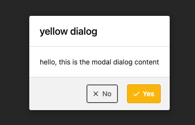
Follow #24097 and #24285 And add a devtest page for modal action button testing. http://localhost:3000/devtest/fomantic-modal Now the `modal_actions_confirm.tmpl` could support: green / blue / yellow positive buttons, the negative button is "secondary". ps: this PR is only a small improvement, there are still a lot of buttons not having proper colors. In the future these buttons could be improved by this approach. These buttons could also be improved according to the conclusion of #24285 in the future.  And add GitHub-like single danger button (context: #24285 (comment)) 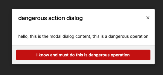 --------- Co-authored-by: silverwind <[email protected]>
|
Thank you all for the suggestions! #24289 summarized the suggestions, and the current approach is:
I think this issue could be closed, let's do more improvements (new issue/PR) in the future. |
|
Maybe #20212 is related to this discussion? |
|
Yes, but some colors are still inconsistent at the moment. |
Feature Description
Which style should be used?
1
2
3
4
5
(5: only text is different from 4)
The text was updated successfully, but these errors were encountered: