Utilization Donut Chart Component #570
Conversation
|
Hi David, how is this component different from the current donut chart? It seems very similar, just wondering why we could enhance the already existing component? |
|
@dtaylor113 that's correct most of this component is a pass through directly for the existing donut charts. Funny enough have an initial version that just adds a couple of additional attributes on top of the pct donut but the sizing was awkward. Overall the differences are around label placement, minor sizing, and center label customizing... all things that a user can potentially do with the config, but with short-cuts/settings/properties instead. Sizing and placement were/are the more bothersome properties to deal with and one of the reasons for separating it out. Now that understand how sizing functions I can look at what converting this version would take, since it sounds like we're good with the add on approach. This works as part of the conversion from attributes back to the config as part of the checklist above |
 cdcabrera
changed the title
cdcabrera
changed the title
|
@dtaylor113 have part of your input, @jeff-phillips-18 do you have input on...
And both...
|

|
@cdcabrera agree with the approach of updating the existing donut chart rather than create a new component |
|
good good @serenamarie125 , @beanh66 @cshinn
@beanh66 @cshinn your input on
|
|
@cdcabrera, you are right that we already have an attribute called 'center-label' which can have values 'used', 'available', 'percent', and 'none', so it sounds like setting it to 'percent' will correctly set the center label. The issue is how can we bundle the 'side labels' so that it's easy for app. dev to customize/specify. |
|
@cdcabrera I agree with enhancing the existing component. |
|
@amarie401 for reference |
cdcabrera
force-pushed
the
feature-utilization
branch
from
58fe455 to
7d25833
Compare
cdcabrera
requested review from
cshinn,
dtaylor113,
beanh66 and
jeff-phillips-18
|
Is this still WIP or ready for final reviews? |
|
@jeff-phillips-18 et all, it's close to final can remove the WIP just...
Then i'll rebase and amend the commit message |
cdcabrera
changed the title
cdcabrera
force-pushed
the
feature-utilization
branch
from
7d25833 to
ed38af3
Compare
src/charts/charts.less
Outdated
| flex-direction: row-reverse; | ||
| } | ||
| } | ||
|
|
There was a problem hiding this comment.
Should this really be put into Patternfly? Is this a Patternfly pattern?
There was a problem hiding this comment.
@jeff-phillips-18 can move it over to core for sure np. There are aspects of charts both within this repository's less and core, just need a direction we want to head?
There was a problem hiding this comment.
After looking a little bit more on this, looks like we have a choice, move now, or move later as a whole. The appearance is, it looks like we attempted to start a PF core aspect to the charts, here:
- https://github.com/cdcabrera/patternfly/blob/master/src/less/charts.less
- https://rawgit.com/patternfly/patternfly/master-dist/dist/tests/donut-charts.html
With a distinction about only how we modify SVG aspects of the Charts within AngularPF. However it looks like we slightly diverged a little and started placing a few more bits inside AngularPF instead of core.
I can go back and move this newer piece over to core now, or hold off based on what's already in AngularPf? But in addition, outside of this PR, we probably need to go through the rest of charts.less and separate them out a bit more.
There was a problem hiding this comment.
@jeff-phillips-18 @dtaylor113 the less has been moved over to core Patternfly PR 720
| @@ -26,6 +26,15 @@ | |||
| * <li>.tooltipFn(d) - user defined function to customize the tool tip (optional) | |||
| * <li>.centerLabelFn - user defined function to customize the text of the center label (optional) | |||
| * <li>.onClickFn(d,i) - user defined function to handle when donut arc is clicked upon. | |||
| * <li>.label - object containing properties for external label (optional) | |||
| * <ul> | |||
| * <li>.orientation - string with possible values: 'left', 'right' (optional) | |||
There was a problem hiding this comment.
This is optional, what is the default?
There was a problem hiding this comment.
Good catch can update the comments/annotation. For our purposes the optional default is it simply doesn't exist, don't have to use it
| * <ul> | ||
| * <li>.orientation - string with possible values: 'left', 'right' (optional) | ||
| * <li>.title - string representing a prefix or title (optional) | ||
| * <li>.label - similar in to the center-label parameter, which specifies the contents of the donut's external label, values: 'used', 'available', 'percent', 'none' (optional) |
There was a problem hiding this comment.
I don't understand the description here.
There was a problem hiding this comment.
Yeah the wording is a little funky reading back on it, can correct it...
| <pf-donut-pct-chart config="configDynamic" data="dataDynamic" center-label="labelDynamic" | ||
| on-threshold-change="thresholdChanged(threshold)"> | ||
| </pf-donut-pct-chart> | ||
| </p> | ||
| </div> | ||
| <div class="col-md-3 text-center""> |
There was a problem hiding this comment.
Not this PR but coul you remove the extra " character.
| @@ -26,6 +26,15 @@ | |||
| * <li>.tooltipFn(d) - user defined function to customize the tool tip (optional) | |||
| * <li>.centerLabelFn - user defined function to customize the text of the center label (optional) | |||
| * <li>.onClickFn(d,i) - user defined function to handle when donut arc is clicked upon. | |||
| * <li>.label - object containing properties for external label (optional) | |||
There was a problem hiding this comment.
Maybe this should be labelConfig or something more descriptive so that it is understood that this is not just a simple label.
There was a problem hiding this comment.
Hi, I don't think .label should be under config, rather it should be a separate param like center-label is, and called side-label with properties orientation, title, and perhaps something like 'amount-type' for available, percent, used.
There was a problem hiding this comment.
Took using side-label into consideration, but when the label can be used on the right, left, and bottom it becomes a slight misnomer, so changed it to label.
Was also going to create it as a separate attribute similar to center-label, but then we blend the use of how center-label functions. We have both a configuration aspect, which takes a function, and the attribute, which takes a string. Based on that took the configuration route all in one, instead of a blended approach, which for myself felt less confusing.
I do agree the label label should probably be changed to something else, I like labelConfig, had also thought maybe outsideLabel, but the Config suffix seems more appropriate.
As a quick fix, I can go ahead and change the label to labelConfig while we continue to discuss.
| </span> | ||
| <span ng-if="$ctrl.data.dataAvailable !== false && $ctrl.config.label && !$ctrl.config.label.labelFn()" class="pct-donut-chart-pf-label"> | ||
| {{$ctrl.config.label.title}} | ||
| <span ng-if="$ctrl.data" ng-switch="$ctrl.config.label.label"> |
There was a problem hiding this comment.
$ctrl.config.label.label I think we do need 'labelConfig' or something clearer. Currently, 'label.label' is tough to read.
cdcabrera
force-pushed
the
feature-utilization
branch
from
ed38af3 to
02f0e4e
Compare
|
@dtaylor113 @jeff-phillips-18 since both commented on the Less, I'll go ahead and look at moving EDIT: I don't necessarily agree with moving this to core by itself, unless we move the entirety of the charts.less |
cdcabrera
force-pushed
the
feature-utilization
branch
from
65dbe68 to
b92fe01
Compare
src/charts/charts.less
Outdated
| @@ -11,6 +11,7 @@ pf-c3-chart { | |||
| width: 100%; | |||
| } | |||
| } | |||
|
|
|||
There was a problem hiding this comment.
Looks like this file's changes could be discarded. No point updating to include an empty line 😉
| * <li>.title - string representing a prefix or title (optional) - default: empty string | ||
| * <li>.label - the wording format to display, possible values: 'used', 'available', 'percent', 'none' (optional) - default: 'used' | ||
| * <li>.units - unit label for values, ex: 'MHz','GB', etc.. (optional) - default: empty string | ||
| * <li>.labelFn - function to customize the text of the external label (optional) - default: undefined |
There was a problem hiding this comment.
Should this function take some parameters? How is the function to know what the label ought to be?
There was a problem hiding this comment.
Can add a note/annotation on there.
The behavior is similar to the existing centerLabelFn callback. That one also seems to be lacking in the documentation/annotation department
|
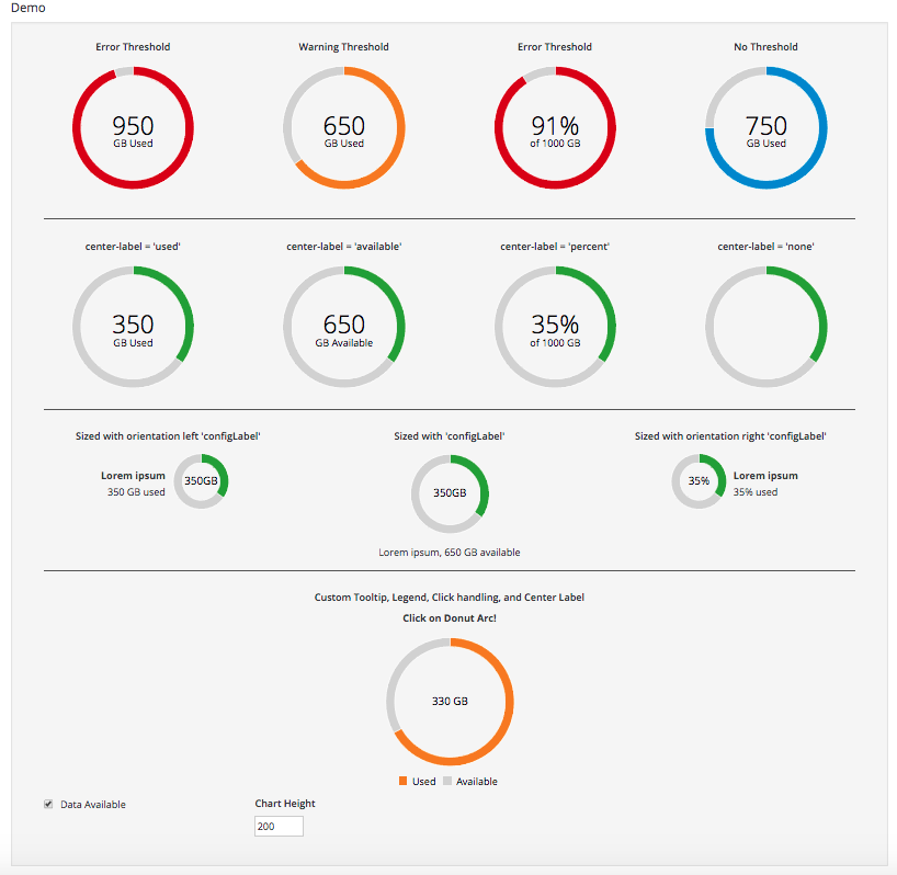
Hi @cdcabrera, I feel like the ngDoc has somewhat gotten somewhat munged (if that is a word :-). Previously, the top row was showing the different Thresholds, the middle row was the different center-labels, the last row was some custom stuff: With your current changes, the first row is now showing Thresholds and some custom label placements, and I think different donut sizes(?). However, there is no ngDoc help text or labels to denote what is being displayed in the first row:
I would suggest leaving the first row to denote the different Thresholds and add a new row which clearly describes the different/new label customizations and placements you are introducing. |


|
@dtaylor113 can add a dedicated row for sure |
|
This PR is dependent on core Patternfly PR 720 for CSS |
cdcabrera
force-pushed
the
feature-utilization
branch
from
b92fe01 to
567bbe7
Compare
|
@dtaylor113 the revised layout linked to Patternfly core PR 720 Edit: included the wrong image... corrected below...
|
 cdcabrera
force-pushed
the
feature-utilization
branch
from
cdcabrera
force-pushed
the
feature-utilization
branch
from
567bbe7 to
c514361
Compare
Enhancement for utilization donut chart component
cdcabrera
force-pushed
the
feature-utilization
branch
from
c514361 to
cf4c16c
Compare
|
The associated core PatternFly PR 720 has been merged, you'll need to update your packages to see the CSS update |
|
@cdcabrera Perfect! Exactly what I was envisioning. |
Description
Implementation for utilization donut chart component.
Create a CPU Utilization Component, which is not embedded in a Card:
In Progress Checklist
PR Checklist
Updated
Previous