Fix "Update Button" example in Python custom buttons doc page #3793
Conversation
This file contains hidden or bidirectional Unicode text that may be interpreted or compiled differently than what appears below. To review, open the file in an editor that reveals hidden Unicode characters.
Learn more about bidirectional Unicode characters
1a182ff to
cbe41e6
Compare
LiamConnors
approved these changes
Sep 13, 2024
Sign up for free
to join this conversation on GitHub.
Already have an account?
Sign in to comment
Add this suggestion to a batch that can be applied as a single commit.
This suggestion is invalid because no changes were made to the code.
Suggestions cannot be applied while the pull request is closed.
Suggestions cannot be applied while viewing a subset of changes.
Only one suggestion per line can be applied in a batch.
Add this suggestion to a batch that can be applied as a single commit.
Applying suggestions on deleted lines is not supported.
You must change the existing code in this line in order to create a valid suggestion.
Outdated suggestions cannot be applied.
This suggestion has been applied or marked resolved.
Suggestions cannot be applied from pending reviews.
Suggestions cannot be applied on multi-line comments.
Suggestions cannot be applied while the pull request is queued to merge.
Suggestion cannot be applied right now. Please check back later.
TL;DR
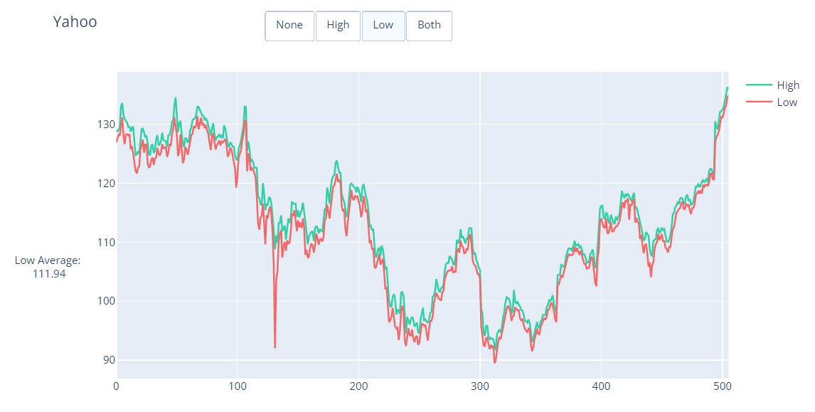
The annotations in the Update Button example in the Python docs do not update correctly when the buttons are clicked (see images below), apparently due to positioning the annotations using date values on a non-date xaxis. This pull request modifies the code defining the annotations so that the buttons update correctly.
Issue Description
Observed behavior:
When the "High", "Low", and "Both" buttons are clicked:
The images below show the appearance of the plot
Initial state:

"High" clicked:

"Low" clicked:
"Both" clicked:

Expected behavior:
Proposed solution
xposition of the "High Average" and "Low Average" annotations to use numerical values instead of date values.xanchor,yanchor,xref, andyrefattributes for the "High Average" and "Low Average" annotations to ensure correct positioning of the annotations to the left of the figure yaxis.Documentation PR
doc/README.mdfiledoc-prodbranch OR it targets themasterbranchIf this PR modifies the first example in a page or adds a new one, it is aDoes not modify the first example or add a new example.pxexample if at all possibleMeaningful/relatable datasets are used for all new examples instead of randomly-generated data where possibleNo new examples added.The random seed is set if using randomly-generated data in new/modified examplesNo randomly-generated data is used.New/modified remote datasets are loaded from https://plotly.github.io/datasets and added to https://github.com/plotly/datasetsNo datasets added or modified.plotly.graph_objects as go/plotly.express as px/plotly.io as piodffig = <something>call is high up in each new/modified example (eitherpx.<something>ormake_subplotsorgo.Figure)fig.add_*andfig.update_*rather thango.Figure(data=..., layout=...)in every new/modified examplefig.add_shapeandfig.update_xaxesare used instead of bigfig.update_layoutcalls in every new/modified examplefig.show()is at the end of each new/modified exampleplotly.plot()andplotly.iplot()are not used in any new/modified example