x/pkgsite: LHS navigation panel is "lossy" #40612
Comments
|
Two ideas for restoring the Index content:
|
|
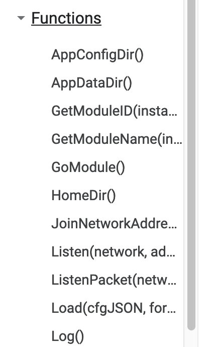
The recent LHS nav changes are problematic. I would like to add a few points (aka complaints, but I'm trying my best to be constructive) that I hope will be rectified soon. Note that the LHS nav truncates even very short signatures & identifiers with "...":
The "Types" category unnecessarily prefixes each type name with the word "type", wasting precious space:
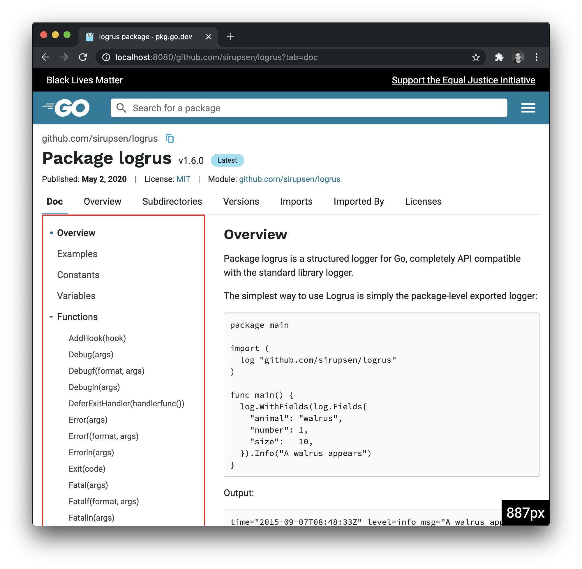
Notice how the "Functions" category does not do this (thankfully). Horizontal space is poorly utilized with the recent redesign. Look at how only ~50% of my screen's width is utilized:
even though there are elements which are getting truncated and are so narrow it's hard to read/use. I'm not saying the content needs to be wider (reading wide paragraphs is not easy), but the nav and spacing between nav and content could be resized/adjusted. Further, since the redesign I've been unable to browse a package's features effectively, because everything is collapsed. I can't browse the method signatures without clicking through each and every one:
Whereas before I could tell at a glance which function I needed. For example: "I have [these input parameters], and I need a [foobar]. I'll just browse this list of methods... aha! This one takes [my parameters] and returns a [foobar]! That must be the one I need." <-- can't do this anymore. I really, really hope the recent design changes will be reconsidered soon and prioritized. Pkg.go.dev is way less useful to me now. |


I agree, and have a comment to similar effect over at #40577 (comment) |
|
Thanks all for the valuable feedback and suggestions. I’m in agreement that we are not using the amount of horizontal space effectively (see #40577). As this is the most viewed page on pkg.go.dev by far, we want to ensure everyone that we’re taking this feedback into account and prioritizing accordingly. We understand how crucial this page is to everyone’s workflow and we’ll be working with our UX partners and the community to improve things. In short, we hear you. |
|
Thanks @andybons
Just to clarify, my primary concern is that this format of presentation is lossy and a backwards step compared to the godoc Index. i.e. people (including myself) place real value in being able to review an overview of the API (see also #40715). (Not using the amount of horizontal space effectively is a derivative issue.) Hence my proposal that in the short term the Index view be brought back whilst we work out the best way forward. |
|
Change https://golang.org/cl/248183 mentions this issue: |
|
To add to this, I find it a bit surprising that while the types and functions in a package aren't included in the main content, the examples are. A good example of this is path/filepath.
On multiple occasions in the last few days I've found myself thoughtlessly clicking on the example link for the function I wanted docs for ("Join" in this case), assuming that was the link to the function doc. This actually kind of works, since the example is right below the function doc, but it is not quite right. In fact, before I realized these were links to examples I thought I'd found a bug where "func Join" was getting hidden under the top banner:
(It is arguably a separate bug that clicking an example link doesn't expand the example) |


That is being tracked in #37520. |
|
As I pointed out in #40715 (which is mostly a duplicate of this bug) there is one additional problem here: even if the LHS panel was expanded by default, it would take way more space than it used to. Moreover it is limited in horizontal space so signatures that are too long require a painfully slow mousehover to be read. (Note: Considering that not everyone is able to use a mouse and that there doesn't seem to be another way to get that information in a visual way this might be also classified as an accessibility issue.) |
…ault

We’ve received feedback that a fully-collapsed side nav prevents users
from being able to see package structure at a glance. Expand all
functions and types by default.

Also updates CSS for the side nav to not show a scroll bar if the
content doesn’t overflow.

Updates golang/go#40612
Fixes golang/go#40715

Change-Id: I22049e394b8705316e1ebe1cb9691c6317c61c5b
Reviewed-on: https://go-review.googlesource.com/c/pkgsite/+/248183
Run-TryBot: Andrew Bonventre <[email protected]>
TryBot-Result: kokoro <[email protected]>
Reviewed-by: Jamal Carvalho <[email protected]>
Thanks for the additional feedback. That CL is just a first step toward addressing things. It is not meant to solve all the issues described here.
I’d like to hear more about this if you could elaborate further. We put a lot of effort to ensure it follows best practices for accessibility (supports keyboard navigation; proper ARIA roles for screen readers). |
I am currently in a situation that prevents me from using a mouse this is why I brought that up. I don't know if that is part of any accessibility guideline, so take this with a grain of salt. Let's say that I get the LHS panel to auto-expand on load. I visit the html/template package documentation and I am presented with this This might only be an issue that affects me, but I still wanted to point it out. |


|
Change https://golang.org/cl/248857 mentions this issue: |
|
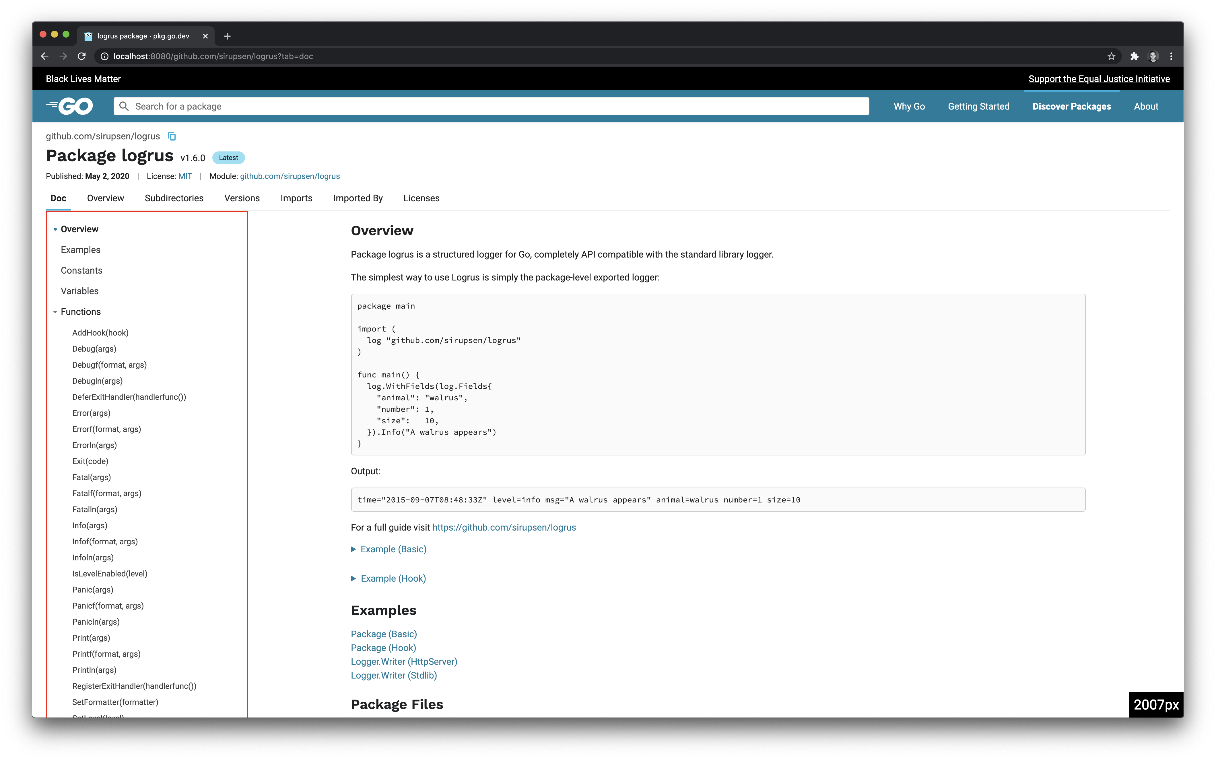
The CL above attempts to make some quick and relatively easy changes to alleviate some concerns, but please keep in mind we are not done yet. The following screenshots show the results. There is no more max width of the header content, the left nav is flush left, and the main documentation takes up the rest of the screen up to 80rem (1280px). As the window gets larger, the side nav also gets wider (at particular breakpoints, though we will likely experiment with a percentage of window size in a follow-up). In the screenshots below, the red border is meant to show the width of the side navigation. As I said above, this is just one step in addressing everyone’s concerns, which we’ve heard loud and clear.
|


|
It’s worth noting that at wide-enough viewports, it may make sense to fully expand an entry in the nav such that
in addition to allowing users to change the sizenav size manually and collapse it if necessary. |
|
Thanks for the update, @andybons.
Has there been any consideration given to restoring a view/section whereby the index can be viewed as it was previously on godoc.org? Because it's the loss of information from that view that hurts - in my case I need a precise overview of the API, not an approximation of it. I can quite understand the desire by some (many?) to have a clickable navigation section on the left. Indeed I don't think that's incompatible with also allowing this index presentation of the API, just that the two might not be best served by the same solution.
One other question I have is whether my expectations of pkg.go.dev are correct in this situation. My position is that this particular change is a breaking change from a UI/UX perspective; not least because (selfishly speaking) I'm having to revert to using godoc.org to view the index. Others may or may not agree on this point. My understanding is that pkg.go.dev is:
Given the above, I'm somewhat surprised that we appear to be iterating "live" on UI/UX changes such as this as opposed to discussing these changes in the form of mocks or on a beta site, before making changes to the live site. Is my understanding of the current status of pkg.go.dev correct? I would certainly be keen to get your and the team's take on whether this is a breaking change, but also how we achieve the apparently contradictory goals of velocity of change with stability. Thanks |
|
What might be helpful to bridge understanding is to operationally define what qualifies as "breaking changes" here. @julieqiu and I discussed this, and wanted to suggest these definitions, since folks may define “breaking” differently:
When I say stability, I don't mean production stability like redundancy, eliminating SPOF, etc. The stability you reference isn't a production or UX breaking change, it's an expectation breaking change. It breaks workflow expectations, causing increased cognitive overload for users to adapt to the change. With regards to “breaking workflow expectations,” too many changes, too many adaptations is seen as unstable, even if the first and second order breaks are all fixed and running. These workflow changes are just as disruptive, since productivity that is lowered while adapting can be seen as its own kind of personal service degradation. And waiting too long to change/roll back means a bit more time to re-adapt. Since developer workflow is a qualitative experience that varies from developer to developer and is hard to measure from an SLO/SLA perspective, we think it is worthwhile to arrive at a sensible policy for ensuring that pkgsite users will be given sufficient time and warning when large changes are proposed that would break workflow expectations. This would allow pkgsite maintainers the agility/flexibility to make changes that affect the first two orders of production breaking changes, and pkgsite users soak time to test and give feedback. Since this discussion is outside the scope of the LHS documentation sidenav, @julieqiu will address the above in a separate issue, and we can continue building a shared understanding there. |
This change places the side navigation flush left and allows the
documentation to expand to fill the rest of the page. The
documentation container has a maximum width of 60rem (960px)
and is flush left in the main container when it can no longer
expand.

Also moves tab name strings into constants and documents the
fields on the basePage struct.

Updates golang/go#40612
Fixes golang/go#40557

Change-Id: Ia1be6ffb04d6c8819371ad12f56e133e2167d2fd
Reviewed-on: https://go-review.googlesource.com/c/pkgsite/+/248857
Run-TryBot: Andrew Bonventre <[email protected]>
TryBot-Result: kokoro <[email protected]>
Reviewed-by: Jamal Carvalho <[email protected]>
|
As someone who has used Go as my primary language for years, I have always been proud of the excellence of the documentation available in our community. I am not saying that Godoc.org is perfect, but I am saying that it rides high above other doc formats/systems in the only way that truly matters: sheer productivity. I have always looked at Godoc as an extension of the principles and ethos of the Go language itself, and I am looking forward to x/pkgsite becoming all that and more (for example, the module version handling is fantastic). The centerpiece of a Go doc page is the Index, which provides a simultaneously deep and wide view of the package. It is the single most valuable element. Between a quick glance or a careful study, the Index will tell you things like:
What I'm saying has echoes in #37863 which was about restoring the erstwhile file listing, where @fflewddur asked:
That was a perfect analysis, and it applies manyfold over for the Index. I can see so much with only a mouse scroll! Just as we wouldn't want to lose the file listing, we wouldn't want to lose the Index without a proper replacement! I am also not against a left listing of some kind to help aid navigation once you are in the mix, but I feel they may be orthogonal. @myitcv has asked about reverting this particular change, and I want to ask for that as well, at least until there is a solid and tested replacement that received great community feedback. Thanks! |
|
Does it matter what the receiver argument is named? Just introduce a concept of "constructor" into Go's lexicon. And whalah:
|

|
It appears some changes have gone live to try and use more of the horizontal space for the LHS nav (but to emphasise, per #40612 (comment) and #40612 (comment), my main issue is the lossy presentation). This now results in a rather strange experience on wide screens when moving between the "Subdirectories" and "Doc" navigation tabs, because the navigation tabs "jump" from the centre to the left, the search bar becomes full width etc:
|


Yes. Godoc often refers to a receiver by its name just like regular arguments (see for example, Edit: And your screenshot does not have receivers in it... |
I know godoc currently refers to it. I'm saying from a UX point of view to ignore it. You don't need excessive details for something that is meant to be a summary. Plus you obtain more space on LHS to display more of the method signature at the expense of losing space for constructors. But there seems to be way more methods than constructors in general such as for time.Time. Maybe I'm wrong but it looks like too many "programmers" are trying to design a UI. |
|
Another note, which is sort of implied but not explicitly called out, is that I can't tell from the LHS if methods have a pointer receiver or not. In terms of Godoc, if you look at |
|
The LHS index, in its current form, is unusable. What was the motivation for this change? godoc.org is one of the best documentation experiences I've ever had and pkg.go.dev is slowly undoing that. |
|
I am really frustrated with the new experience every single time I go to the pkg site and I'm surprised it's still around given the overwhelmingly negative feedback in this thread. As myitcv pointed out it doesn't seem like this change was sufficiently A/B tested or otherwise proposed, given adequate testing and feedback time and then implemented on the live site only after the testing showed an average increase in developer satisfaction with the documentation. Many odd quirks exist with this new implementation such as having to expand or close a type just to navigate to the type. JavaScript being a requirement. As well as many other issues highlighted above. To me it is also important that Go presents a universal interface for documentation everywhere. The standard library is still documented in the godoc style: https://golang.org/pkg/archive/tar/ The fact that the pkg site has deviated from this is confusing and unnecessary. It was great to have a uniform documentation style for every package regardless of third party or stdlib for newcomers to the language and veterans alike (seriously, this is a HUGE thing). It's been a month and a half of pain with the pkg site and I really would like to see a plan of action now. This may seem extremely demanding and entitled but as far as I can see in the previous survey https://blog.golang.org/survey2019-results Docs has never really been a huge pain point - that to me says that people enjoy the way godoc formats documentation currently. It's true the pkgsite is solving an immediate problem nowadays (Modules) and that's fantastic, it's why I continuously hit the "always use pkgsite" thing on the godoc site. However this particular change is extremely negative for me. The only other feedback I can find on it has been negative as well (this thread among others as well as talking to colleagues about it). In that light, I hope we can see a reversion, or this view hidden behind a cookie'd option while the old view remains the default for consistency with the main golang.org site and I hope we can see this soon. If there's any bandwidth problems I'd be very happy to contribute to speed it up; just let me know. Thanks for all the hard work on the package site! It's really coming along. |
|
Cross post from #41585 (comment)
Looks really impressive at first glance. Having the index back has made my day 😄 |
|
As @myitcv mentioned, the index has been added back on beta.pkg.go.dev! Closing this issue for #41587. Feel free to share additional feedback on that issue. |
What is the URL of the page with the issue?
https://pkg.go.dev/cuelang.org/go/cue?tab=doc
What is your user agent?
Screenshot
What did you do?
Visited the page.
What did you expect to see?
An overview of the package API, like the old godoc Index:
https://godoc.org/cuelang.org/go/cue
What did you see instead?
A collapse partial representation of the API. Specifically, per #40577, the API itself is by default hidden, and there is no way to auto-expand it
The representation in the LHS is also heavily condensed in order to fit the space. This leads to a very lossy representation. For example:
gets condensed to (side note: frustratingly I can't copy-paste text from the LHS tree view):
So now I can't, at a glance, get a view of the entire API - I have to jump to each item separately because of the lossy LHS display.
This condensed representation is also misleading. Consider:
which sits under the
type Instancenode. The actual signature here is:i.e. a slice is returned instead of a
Instanceor*Instance. Again, this sort of subtle distinction is lost in the condensed view.IMHO the LHS navigation area is always going to have to compromise in ways that are lossy in general, hence the Index should be brought back.
How then would people navigate through the API?
There is already the
fkeyboard shortcut that allows you to jump to an identifier.There might be other means by which the entire index can be shown (in a popup perhaps?) and then clicked to navigate - I hasten to add (in case it's not obvious from the quality of that suggestion) that I'm in no way a UI/UX expert.
The text was updated successfully, but these errors were encountered: